The crowding problem
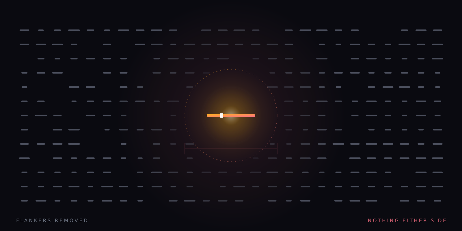
A letter you can read easily on its own becomes hard when other letters sit beside it. Crowding is normal, it is measurable, and it is the one thing single-word presentation does not merely reduce but abolishes.
What this piece argues
- Crowding is a normal property of peripheral vision, not a pathology
- An enlarged crowding zone in some struggling readers is reported but contested
- Spacing has reasonable support; overlays and special typefaces have much less
- Removing flankers also removes parafoveal preview, which is a real loss
Hold your gaze on a word in the middle of this line and try to identify a letter four or five words to the right without moving your eyes. The letter is large enough. The light is fine. It is simply unavailable, jammed in among its neighbours, and it becomes available the instant you look at it. That is crowding, and it is one of the hardest constraints on how much text a reader can take in at once.
The effect is easy to state and slightly unnerving to demonstrate. A letter presented alone in the periphery can be identified reliably. Flank it with other letters and identification collapses, even though nothing about the target itself has changed — same size, same contrast, same position on the retina. The information is arriving. What fails is the isolation of one thing from the things next to it, somewhere downstream of the retina, in the machinery that decides where one object ends and another begins.
Crowding is not a defect. It is a normal feature of peripheral vision in every sighted person, and it is the reason reading is saccadic in the first place. If crowding did not exist, a reader could take in most of a line from a single fixation and the whole edifice of eye-movement research would be about something else. Instead the eye must move, roughly seven to nine characters at a time, bringing each stretch of text into the small central region where crowding is weak enough for letters to be separated.
Bouma’s rough rule
The effect scales with eccentricity — the distance of the target from where you are fixating. Close to the centre of gaze, flankers must be very close to interfere. Further out, they interfere from much further away, and the zone within which they do so grows roughly in proportion to the eccentricity itself. Bouma’s law is the standard shorthand for that relationship: the critical spacing is on the order of half the distance from fixation. It is a rule of thumb rather than a constant, and it varies with the observer and the task, but it has held up well enough to be the first thing anyone reaches for.
Two practical consequences follow. First, crowding is a spacing problem before it is anything else, which is why every serious mitigation starts by pushing things apart. Second, the central few characters around fixation are close to crowding-free, which is why reading works at all and why the useful field of view in reading is so much narrower than most people assume. The advertised skill of taking in whole lines at a glance is not a skill anybody has been trained out of. It is a shape the visual system does not make.
The reading-difference angle, carefully
An enlarged or extended crowding zone has been reported in some struggling readers and in some dyslexic readers: flankers interfere from further away than they do in matched controls, which would mean less usable text per fixation and more effort for the same paragraph. The finding is real and it has been reported by more than one laboratory. What it means is where the argument starts. It may be a perceptual difference contributing to the reading difficulty. It may be a consequence of reading less, or of reading differently, over many years. It may be a marker of something else again.
So the honest statement is that this is a correlate, not an established cause. The dominant account of dyslexia is phonological — a difficulty with the sound structure of language and its mapping onto letters — and the crowding literature does not overturn it. Anybody telling you that crowding causes dyslexia has skipped several steps, and the skipped steps are the interesting ones. That distinction matters practically too: a spacing change is a good bet for making a page easier to get through, and it never becomes instruction no matter how well it works. The argument for keeping those apart is set out in decoding is not comprehension.
What people already do about it
Crowding is one of the few perceptual findings that has produced practical advice sitting in real products. The advice varies enormously in how well it is supported, and the products rarely distinguish. Here is the ranking as we read it, which is the ranking the evidence supports rather than the one the marketing does.
- Letter and line spacing
- The strongest of the ordinary interventions. Pushing characters and lines apart directly targets the mechanism, and increased spacing has been found to improve reading speed and accuracy in dyslexic children with no training involved. This is why nearly every reading tool now ships a spacing control, and it is the one to reach for first.
- Shorter lines and wider margins
- Reasonable, if less directly about crowding. A shorter measure means fewer return sweeps and less place-keeping, and the return sweep is where line-tracking errors concentrate. Cheap to try, hard to get wrong, unlikely to be dramatic.
- Coloured overlays and tinted lenses
- Widely used and often warmly described by the people who use them. The controlled evidence is weak, and the better-designed studies have generally not supported the specific claims made for colour. That does not make anyone’s experience of comfort false — reading is a task where comfort is worth something on its own terms — but comfort and a mechanism are different claims and only one of them is being tested.
- Dyslexia-specific typefaces
- Popular, sincerely made, and preferred by many readers when asked. Controlled comparisons have generally not shown them beating a well-spaced ordinary sans-serif. The most likely reading is that much of what these faces deliver is spacing and weight — which you can get from the spacing controls you already have, applied to a font you already like.
- Single-word presentation
- Not a mitigation at all. See below: it is a structural removal, which makes it stronger on this one axis and costlier on another.
Every other approach moves the flankers further away. This one deletes them.
The mechanism, stated plainly
The limiting case
Increased spacing is a continuum, and there is an end of it. If you keep pushing the neighbouring words apart, eventually there is one word on the screen with empty field on every side. That is what this app does, not as an accessibility mode bolted on afterwards but as the basic way it works: a single word, at a fixed point, with nothing to its left and nothing to its right. Crowding is not reduced under those conditions. It has no flankers to operate on. There is nothing there.
That is an unusually clean mechanism, and we think it is the strongest mechanistic argument in the whole product — cleaner than anything we can say about pace, cleaner than anything we can currently say about the paired imagery. It requires no assumptions about attention, motivation or the untapped potential of anything. It is a statement about what is and is not present on a screen, and it is either true or false by inspection. Most claims in this industry are not that easy to check, which is precisely why we lean on this one.
What you give up
Now the part that costs us. The flankers were not only interference. While the eye fixates one word it is also collecting a preview of the next one — coarse information about its length, its shape, sometimes its first letters — and the eye-movement literature is clear that this parafoveal preview is genuinely useful. Deprive a reader of it and reading slows. When we delete everything to the left and right of the current word, the preview goes with it. There is no next word to see early, because there is no next word on screen at all.
So this is a trade, not a free win, and it should be described as one. On one side: crowding gone, no line to track, no return sweep, no place to lose. On the other: no preview, and no ability to look back at the word you have just left, which for syntactically dense prose is a real loss and the best argument anyone can make against this entire class of tool. Which side of that trade a given reader lands on depends on how much each of those two things was worth to them, and that is an empirical question about a person, not a fact about the technique.
Testing it on yourself, which is the only test that applies to you
If you want to know whether crowding is doing meaningful damage to your reading, the ordinary controls will tell you most of it before you go anywhere near a stream. Open something you have to read, push the letter and line spacing up until it looks slightly excessive, and see whether the page gets easier. If it does, you have learnt something useful and cheap, and you should keep that setting everywhere it is available to you.
If it does help, the limiting case is worth twenty minutes. Run the same passage through the app at a slow setting — 120–180 wpm is a perfectly ordinary choice and plenty of people stay there — and take the recall check at the end, which mixes words that genuinely appeared with plausible distractors and is not designed to flatter you. Then run a comparable passage as plain text and take it again. If the score falls, the preview you lost was worth more to you than the crowding you removed. That is a real answer about your own vision, and it costs nothing but the afternoon.
A note on what this is. Signal is written in-house by the team that builds Reader Inc., so treat it as an argument rather than a review. Nothing here is medical, psychological or educational advice, and the app is not a treatment, therapy or diagnosis for any condition. Where we describe research we describe it in general terms; where we are reasoning past the evidence we say so. The app is free, runs entirely on your own device, and ships with a comprehension test switched on — which means you can check every claim we make against your own reading rather than taking our word for it.
Read next
Decoding is not comprehension
Dyslexia is a difficulty with word recognition, decoding and spelling. It is not a difficulty with thinking. That distinction decides which tools are honest, which are useless, and what a presentation setting is entitled to claim.
The bold-prefix family
Bolding the first few letters of every word became one of the most popular reading interventions ever released, and one of the least supported. That gap is worth taking seriously rather than scoring points off.
Let the word come to you
Word-by-word presentation removes eye movement completely, and eye movement is a real cost. It is also a much smaller cost than the speed-reading industry needs it to be. Here is the arithmetic, with nothing rounded up.