Eight ways to pair a word with a picture
A visual reading aid has one core decision to make: where the picture sits relative to the word. We ship eight answers because we do not know which one is right — and this is a map of the design space, limits included.
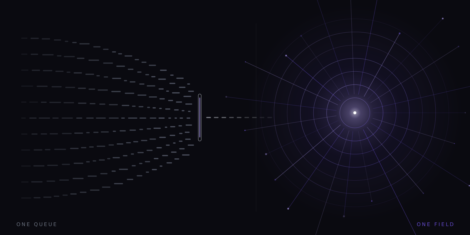
What this piece argues
- Eight pairing modes span a design space from plain text to no text at all
- Some modes are reading with support; others are drills — icon-only is not reading
- Animation moves sub-elements only, so the icon stays legible without stealing fixation
- Which mode helps whom is untested; all eight ship and the default is conservative
Once you have decided to pair every word with a picture of its sense, you inherit a harder question: where does the picture go? Above the word, behind it, beside it, before it, instead of it? Each answer changes what the reader’s eye does and what the exercise even is. We ship eight answers rather than one, and this piece is the map — what each mode is for, which of them are actually reading, and what we do not yet know about any of them.
The reason there are eight, and not one blessed layout, is that the modes are not variations on a theme. They are different positions in a genuine design space with two axes. One axis is spatial: how close the icon sits to the point your eyes hold, from out of the way to directly on top of it. The other is temporal: whether icon and word appear together, in sequence, or in each other’s place. Move along either axis and the balance of the two channels shifts — more word, more picture — until at the far ends one channel disappears entirely.
That balance matters because the two channels are not interchangeable. The case for pairing at all rests on dual coding — verbal and imaginal codes are partly separable, and material encoded in both is remembered better — and on the picture superiority effect, one of the most replicated findings in memory research. The full argument lives in the second channel. But dual coding is an argument for two channels running together. Several of our modes deliberately break that arrangement, and the honest way to present them is to say plainly which ones.
The eight modes
- Icon above word
- The default arrangement most people picture: word at the fixed point, icon floating above it. The word owns fixation; the picture rides in the visual surround. The least disruptive way to run both channels at once.
- Icon behind word
- The icon sits at the fixation point itself, rendered faintly behind the text. Nothing extra to glance at — but the picture now shares pixels with the letters, and legibility is bought with contrast.
- Icon beside word
- Word and icon side by side, like an illustrated dictionary entry compressed to one line. More separation than behind, more pull than above; the mode most likely to invite an actual glance away.
- Icon flashes then word
- Sequence instead of simultaneity: the picture appears first, briefly, then gives way to the word. The image primes the sense before the letters arrive. Costs time, which at speed is the scarcest thing there is.
- Icon replaces word
- The picture appears instead of the word wherever the resolver has one. Text becomes intermittent pictography. Striking, occasionally illuminating — and no longer reading in any strict sense.
- Word only
- The stream with the imagery switched off entirely. Plain RSVP, and the control condition every other mode should be compared against. If a mode cannot beat this for you, it has no business being on.
- Icon only
- Pictures without words: the resolver’s output alone, in sequence. A drill and a demonstration, discussed below — not reading, and not presented as such.
- Alternating
- Words and icons take turns carrying the stream. A hybrid drill that forces attention to keep re-anchoring between channels; the least conservative mode we ship.
All eight modes draw from the same supply line. Wherever the icon appears, it arrives from the resolver’s five tiers — 528 hand-drawn curated icons covering some 3,100 sense entries, then compounds, then morphological overlays, then a restyled open-source library of more than 200,000 marks, then a procedural fallback that derives a deterministic mark from the word itself and therefore cannot fail. The modes decide where a picture goes; the tiers decide what it is; and because the last tier always answers, every mode works on every word rather than degrading to a special occasion.
Notice what the two ends of the list are. Word only is the null mode — the honest baseline, and the answer to a fair question, which is why anyone testing this app on themselves should start there. Icon only is the opposite pole: the word channel gone completely. Between them the other six trade the channels off in different proportions, which is the sense in which this is a space rather than a menu.
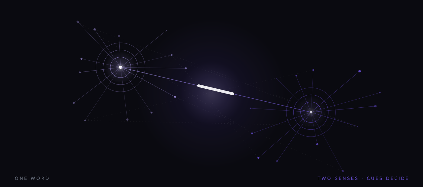
Which of these are reading
A visual reading aid should be able to say where the reading stops, so: the first four modes are reading with support. The word is present, fixated and processed; the icon accompanies it, simultaneously or a beat early. Whatever the picture contributes, the reader is still doing the thing this whole product is nominally about — running text through the language system. If picture and word association is doing useful work anywhere in this app, it is in these modes, where the association actually has both halves present.
Icon replaces word and icon only are different animals, and we decline to blur this. When the word is absent, the language channel is not being supported; it is being bypassed. What remains is a sequence of senses without syntax — no tense, no negation beyond what a derived overlay can gesture at, no subordinate clauses, none of the machinery that makes prose mean precisely rather than approximately. These modes are drills: exercises for noticing what the resolver thinks a text is about, for testing whether an icon vocabulary is learnable at speed, for demonstrating how much of meaning lives in exactly the structure the pictures cannot carry. That last lesson is real and slightly humbling, which is why the modes stay. But time in them is not reading time, and a streak of icon-only sessions is not a reading habit.
An icon stream has senses without syntax. The grammar was in the words all along.
What the drill teaches
The sequenced mode — icon flashes then word — deserves its own caveat, because it looks like the best of both worlds and quietly bills you for it. Putting the picture first means the sense arrives before the letters do, which is an appealing story about priming. But the flash occupies real milliseconds, and at any ambitious rate those milliseconds come out of somewhere: either the stream slows to accommodate them or the word’s own dwell is squeezed. At gentle speeds this is an easy trade to carry. At the rates people buy reading machines hoping to reach, a per-word preamble is a tax on exactly the resource being chased — which is why this mode is best thought of as a comprehension aid for slow, difficult reading rather than a speed technique.
Alternating sits awkwardly between camps, which is why we call it the least conservative thing we ship. Half its stream is words, half is pictures standing where words would be, so it inherits half of each argument. Our own guess is that it functions as a drill with reading mixed in rather than the reverse — but that is a guess, flagged as one.
Keeping the picture from stealing the point
Every simultaneous mode has the same failure waiting in it: the icon becomes the show, fixation drifts off the word, and the aid converts itself into a distraction. Motion is the dangerous ingredient — the peripheral visual field is exquisitely tuned to it, which is precisely why a moving icon can be noticed without being looked at, and also why a carelessly moving one drags gaze away from the text.
Our answer is a motion grammar of 28 animation primitives — travel, drip, flicker, spin, flow, pulse, grow, draw, sway, breathe and the rest — with one governing rule: primitives apply to sub-elements, never to the whole mark. The raindrops fall; the cloud holds still. The frame of the icon stays planted, so there is no bulk movement for the periphery to chase, while the small interior motion carries what the sense needs — enough life to register as rain rather than a grey lump, not enough to bid for fixation against the word. One slider scales all of it to zero, and prefers-reduced-motion silences it without being asked.
How to choose, given that nobody knows
Conservative defaults are not timidity; they are what honest ignorance looks like in a settings panel. A first-run experience determines what a new reader thinks the product is, and if the first session opened in the most spectacular mode, we would be using surprise to make an argument the evidence has not made. So the stream you meet first keeps the word primary and the icon subordinate, and the stranger regions of the design space wait behind a deliberate choice. The reader who ends up in icon-only got there on purpose, knowing which activity they left.
Given honest ignorance, the selection method is self-experiment, and the shape is the same one we recommend everywhere: hold your material and speed steady, run comparable passages in word only and in one paired mode, take the recall check each time, and let the scores — not the sensation of helpfulness — pick the winner. Sensation will vote for whichever mode feels rich; the score is under no such obligation. A mode that costs you recall is out, however good it looks in a demonstration.
And if the winner for you is word only, believe your data. It would be a strange product confession anywhere else, but a reading tool that measures honestly has to be prepared for the measurement to decline its favourite feature. The icons earn their place per reader, per mode, against a plain baseline that ships in the same box — which is, we think, how claims about pictures and words should have to earn their keep. For where the pictures themselves come from, and what happens when one word has two senses to draw, see two banks, one word.
A note on what this is. Signal is written in-house by the team that builds Reader Inc., so treat it as an argument rather than a review. Nothing here is medical, psychological or educational advice, and the app is not a treatment, therapy or diagnosis for any condition. Where we describe research we describe it in general terms; where we are reasoning past the evidence we say so. The app is free, runs entirely on your own device, and ships with a comprehension test switched on — which means you can check every claim we make against your own reading rather than taking our word for it.
Read next
The second channel
Most reading tools treat pictures as ornament. In this one the picture is structural — it is there to carry the load that the inner voice drops when the words start moving too fast to pronounce.
Pictures before words
For a great many readers the picture is not a decoration on the text. It is the primary channel. There is a serious, decades-old tradition of building for those readers, and we are standing downstream of it.
Two banks, one word
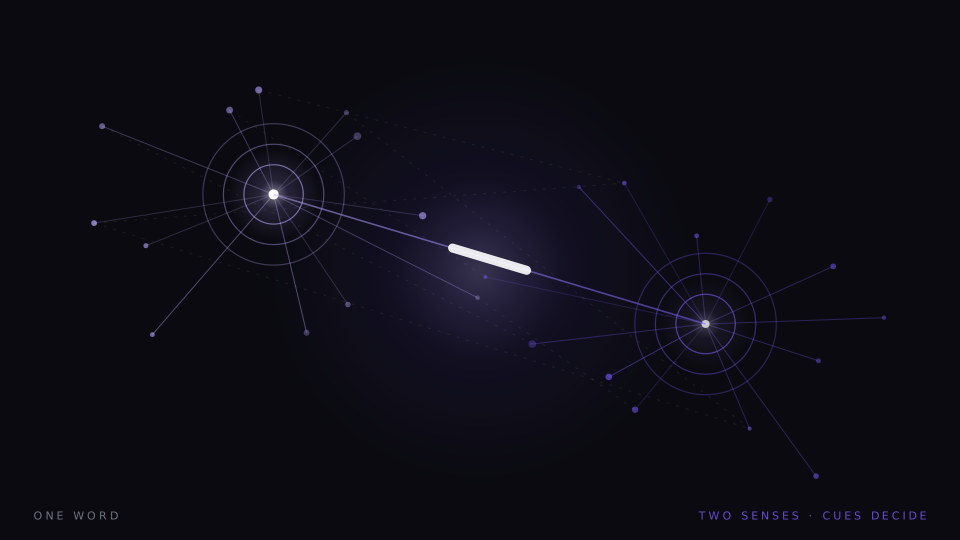
Every image in the stream depends on a decision made in a quarter of a second: which sense of this word did the sentence mean. Get it right and nobody notices. Get it wrong and you have injected a meaning that was never there.