Nothing left blank
A picture dictionary that covers ninety-four per cent of English fails on the words that were carrying the meaning. Five resolvers, tried in order, with a last one that cannot fail — and an honest account of what the last one is worth.
What this piece argues
- Coverage is not a percentage to improve; it is a guarantee that must hold
- High-coverage systems fail precisely on rare words, where reading is hardest
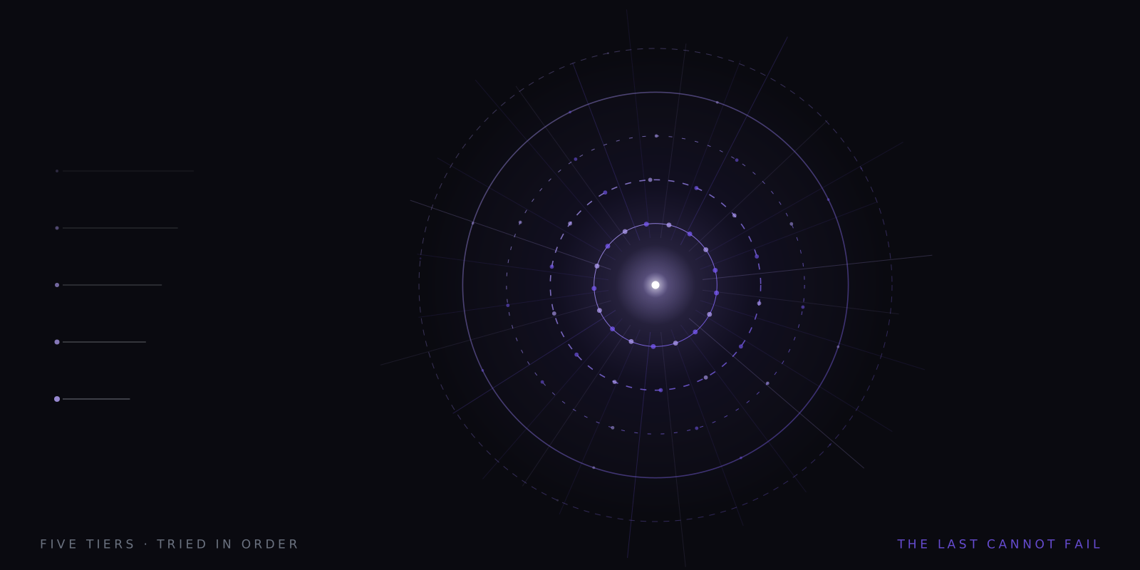
- Five tiers: curated, compound, derived, library, and a procedural floor
- A procedural mark is a consistent handle, not a picture of the concept
Most systems that attach pictures to words report a coverage figure, and the figure is usually impressive. Ninety-four per cent. Ninety-seven. It sounds like the sort of number you would be pleased with, and in almost any other engineering context you would be. In this one it describes a product that breaks at the worst possible moment, and the reason is in the shape of the language rather than the shape of the number.
English vocabulary is steeply skewed. A small set of words does most of the work of ordinary prose, and a very long tail of rare words does the specific work — the technical term, the proper noun, the precise verb the writer chose because no common one would do. When a system covers ninety-four per cent of the tokens on a page, the six per cent it misses are not scattered at random. They are the rare ones. They are, with grim reliability, the words the sentence was actually about.
So the missing images cluster exactly where reading is hardest and where help would be worth most. A reader who already knows what the, and and because mean is handed a picture for each of them, and then meets anastomosis or escheat or borborygmus and gets nothing. Stated that way it is obviously the wrong distribution of effort, and it is what a percentage-based approach produces by construction.
What a blank frame does
There is a second problem, and it is about rhythm rather than semantics. At 400 words per minute a frame lasts around 150 milliseconds. The reader is not consciously inspecting each image; they are entrained to a pattern in which a word and a mark arrive together. Break that pattern and the break itself becomes an event. The eye notices the absence, attention goes looking for what changed, and a small piece of processing is spent on the interface instead of the sentence.
A hole in the stream is therefore worse than a weak image in the stream. It interrupts, and it interrupts at precisely the moment when the reader had encountered a word difficult enough that the system could not draw it — which is the moment they could least afford the distraction. That is the whole argument for treating coverage as a guarantee rather than a statistic to be gradually improved. There is no acceptable failure rate here, because the failures are not distributed like a rate.
Five resolvers, tried in order
The design that follows from that is not clever. It is just stubborn. Five resolvers, each tried in turn, each cheaper in meaning and broader in reach than the one before it, ending in one that is incapable of returning nothing. A word enters at the top and leaves with a mark, always. The interesting engineering is not in any single tier — it is in the ordering, and in the decision that the last tier is allowed to be poor as long as it is guaranteed.
| Tier | How it gets an image | Reach |
|---|---|---|
| 1 · Curated | Hand-drawn, sense-disambiguated | 528 icons, ~3,100 sense entries |
| 2 · Compound | Split into known parts and composed | Any word made of known pieces |
| 3 · Derived | Stem plus a morphological overlay | 10 modifiers |
| 4 · Library | Open icon sets, restyled and normalised | 200,000+ icons, 150+ sets |
| 5 · Procedural | A mark computed from the word itself | Literally everything |
The obvious objection is why the order is not simply reversed — if tier four already has 200,000 icons, why bother hand-drawing 528. The answer is that reach and rightness are different properties. A large open set will have something filed under almost any common word, and that something is chosen by whoever needed an icon for an interface, with no notion of which sense of the word you meant. A curated entry knows there are two banks. An imported one does not know there is a question. So the ladder runs from most specific to most general, and a word only falls to the next rung when the rung above genuinely has nothing to say about it.
The three that run offline
Tier one is the curated lexicon: 528 hand-drawn icons carrying roughly 3,100 sense entries between them, which is the ratio you end up with once you accept that a word is not a key and that bank needs two drawings rather than one. This is where the effort goes, because it is where the payoff is largest — the high-frequency core of English, drawn deliberately, with cues attached so the right sense is chosen. It ships inside the file and needs nothing from the network.
Tier two handles composition. English builds new words by sticking old ones together and, helpfully, is mostly head-final about it: a riverbank is a kind of bank, a snowstorm is a kind of storm, a bookshelf is a kind of shelf. Split the unknown word, resolve the parts, compose the mark. There is a pleasant side effect here — each half disambiguates the other, so riverbank resolves to the sloping-edge bank without needing any context from the sentence at all. The word contains its own window.
Tier three handles morphology as overlays. Ten modifiers cover the productive patterns: agent, negation, plural, tense, intensity, possibility, repetition and the rest. Hopeless is the hope icon carrying a negation overlay. Rewrite is the write icon carrying a repetition overlay. Teacher is teach with an agent mark. These regularities are well documented in linguistics and cheap to exploit, and between them tiers two and three absorb a great deal of what would otherwise be tail.
The library, and its price
Tier four reaches outside. There are more than 200,000 open-source icons across over 150 sets, and between them they have drawn a great many things nobody would hand-draw for a reading app. Pulling from them raises an immediate aesthetic problem: they were made by different people in different weights and idioms, and a stream that switches drawing style every fourth word is visually exhausting. So each icon is restyled into a single stroke language, normalised for weight and optical size, and animated by the same motion grammar as everything else. After one fetch it is cached, and the word is offline forever afterwards.
The honest caveat about tier four is quality variance. These sets were drawn for interfaces, not for semantics, and the mark filed under a word is sometimes a metaphor from a different domain — a light bulb for idea, a rocket for launch. That is fine for a toolbar and thinner than we would like in a reading stream. It is still better than nothing, and considerably better than the tier below it, but it is the point in the ladder where the images stop being ours.
The last tier is allowed to be poor. It is not allowed to be absent.
The ordering principle, stated once
The floor
Tier five is the one that makes the guarantee true. Given any string at all, it computes a deterministic mark from the word itself — the same input produces the same geometry on every machine, forever, with nothing stored and nothing fetched. Borborygmus draws its shape here. So does a surname, a chemical name, a case citation, a word invented by the author two paragraphs ago. There is no lookup to miss, because there is no lookup.
This is genuinely useful for one specific job. It gives a rare word a stable visual identity, so the second and third time it appears in a document it is recognisably the same thing, and the reader gets a handle to hang the definition on. Human memory for distinct visual forms is very good, and a consistent unfamiliar mark is more tractable than an unfamiliar string of letters. That is a real function and we would defend it.
Labelled, always
Which is why every image in the stream is tagged with the tier that produced it. A reader can see, at a glance and at speed, whether they are looking at a drawing made deliberately for that sense, a composition, a restyled import, or a shape derived from spelling. The alternative — presenting all five with the same confident finish — would mean the strongest tier lending its credibility to the weakest, and a reader trusting a procedural mark the way they trust a curated one is being quietly misled by a design decision.
It also makes the system falsifiable in a small way. If composed images turn out to be weaker than drawn ones, or tier-four imports weaker than either, you can see exactly which words those were and check your own recall against them. That reasoning runs through the case for the second channel and through the sense-disambiguation problem as well: the argument only stays honest if the reader can tell which part of it is doing the work at any given moment. Load a document from your own field into the app and watch the tier labels. On a technical page you will see the ladder descend in real time, and you will know precisely where the promise thins out.
A note on what this is. Signal is written in-house by the team that builds Reader Inc., so treat it as an argument rather than a review. Nothing here is medical, psychological or educational advice, and the app is not a treatment, therapy or diagnosis for any condition. Where we describe research we describe it in general terms; where we are reasoning past the evidence we say so. The app is free, runs entirely on your own device, and ships with a comprehension test switched on — which means you can check every claim we make against your own reading rather than taking our word for it.
Read next
Two banks, one word
Every image in the stream depends on a decision made in a quarter of a second: which sense of this word did the sentence mean. Get it right and nobody notices. Get it wrong and you have injected a meaning that was never there.
Semantics on the device
A neural voice with 82 million parameters already runs inside this browser tab. The question is whether a model that understands word sense can join it — offline, inside a 150-millisecond frame, without a download nobody would accept.
Let the word come to you
Word-by-word presentation removes eye movement completely, and eye movement is a real cost. It is also a much smaller cost than the speed-reading industry needs it to be. Here is the arithmetic, with nothing rounded up.