Reading on the wrist
A watch face is forty millimetres of glass and the worst reading surface ever mass-produced — unless you only ever show one word. Here is the concept, and the four things that would have to be true before we built it.
What this piece argues
- A watch is a terrible page and a surprisingly good single-word display
- One word at a fixed point needs no line to track, no scroll and no zoom
- The wrist makes RSVP’s worst flaw worse: there is nowhere to re-read
- None of this is built or tested — it is a design argument, not a product
A watch face is the worst reading surface anyone has ever mass-produced. Forty-odd millimetres of glass, held at the end of an arm that is usually doing something else, attached to a screen engineered to go dark before you finish a sentence. It is also, if you only ever show one word, close to exactly the right size. That contradiction is the entire concept.
Everywhere Reader Inc. currently runs, it wastes almost all of the display it was given. The app puts one word at a fixed point in the middle of a thirteen-inch screen and leaves the rest dark. On a phone it is the same word, in the same place, with less glass around it. In three years of building this nobody has once needed the space at the edges, because the design never used it. A watch is the first surface where that stops being waste and starts being fit.
So this piece is a concept, and it should be read as one. There is no watchOS build, no Wear OS build, no waiting list and no date. It has not been prototyped on hardware, it has not been put in front of a single reader, and every sentence below that sounds like a benefit is reasoning rather than evidence. The honest reason to publish it now is that the argument is falsifiable, and writing it down is how it gets tested.
The surface was never the constraint
The finding that ends most speed-reading claims also happens to be the one that makes a watch plausible. The bottleneck in reading is language processing, not vision. Remove eye movement entirely — which is what single-word presentation does — and reading gets somewhat faster, not multiples faster. The corollary is rarely stated: if vision was not the limiting factor, then the amount of glass in front of you was never doing the work either. A display that cannot show a paragraph has not taken anything from a reader who was never shown a paragraph.
What a small screen normally costs you is line tracking, pinch-zoom and the constant negotiation between text size and how much text fits. At one word at a time, all three costs go to zero rather than getting smaller. There is no line to lose your place in, no reflow, and no trade to make between legibility and column width — a word can be rendered enormous on a watch precisely because it is the only thing on screen. The crowding problem is not reduced at 40mm, it is abolished, for the same reason it is abolished at 27 inches: there are no flanking words to interfere.
What a watch is, dimensionally
It is worth being literal about the hardware, because the concept lives or dies on numbers rather than enthusiasm. A large modern smartwatch gives you roughly 400 by 480 points of screen, a screen that is designed to wake for seconds and then time out, a single speaker, no keyboard worth the name, and a battery that treats a permanently lit display as an emergency. Those are hostile conditions for a reading app and neutral conditions for a word.
| Constraint | A page on a watch | One word on a watch |
|---|---|---|
| Glass available | Fits perhaps 25 words at a readable size | Needs one word and one icon |
| Type size | Traded against how much text fits | Free — nothing competes for the space |
| Line tracking | Every line break is a chance to lose your place | No lines exist |
| Scroll and zoom | Constant, one-handed, on a moving arm | None |
| Screen wake | Times out mid-paragraph | Times out between words, which is a pause |
| Re-reading | Awkward but possible | Impossible — the word is already gone |
The screen timeout is the interesting one, because on a watch it is usually the enemy and here it might not be. A paragraph interrupted by a display going dark is a paragraph you have to find your way back into. A stream interrupted between two words is a pause — the reader lowers their arm, the word that was showing is the word that will be showing when they raise it again, and nothing has to be recovered. Battery is a harder problem and we have no clever answer to it: a lit screen and a running voice are the two most expensive things a watch can do, and doing both for twenty minutes is a real cost to a device someone also needs for the rest of the day.
Who would notice the difference first
The people for whom this would matter most are the ones for whom conventional reading surfaces already impose a tax that has nothing to do with their comprehension. That is the same argument the rest of this magazine makes, applied to a smaller piece of glass, and it is worth listing plainly rather than gesturing at.
- Readers with dyslexia. Dyslexia is a difficulty with accurate and fluent word recognition and decoding — not with thinking, and not with understanding something when it is read aloud. A surface that presents one word, pairs it with a picture, and can speak it at the same time is attacking decoding load on three channels at once. Whether that helps more at 40mm than at 13 inches, nobody knows.
- Readers with low vision. A watch can render a word at a size a phone cannot render a sentence. The usual accessibility bargain — make the type bigger, get less text and more scrolling — does not apply when the text was never going to be more than one word.
- Readers who lose the thread rather than the words. A fixed point that advances on its own removes the moment where attention wanders and the eye has to find the line again. This is our own reasoning, not a research finding, and the counter-argument is real: a stream that will not wait for you is a stream you can fall behind.
- Anyone reading one-handed. Carrying a child, holding a rail, wearing gloves, standing on a platform. A wrist needs no hand at all, which is a genuine and unglamorous accessibility gain for people with limited grip or one usable arm.
- People whose reading piles up in gaps. Four minutes in a queue is not enough time to open a laptop and is exactly enough time for six hundred words.
A watch cannot show you a paragraph. Neither can we. That is the fit.
The concept, stated plainly
What it would cost
Single-word presentation already has one serious flaw, and a watch makes it worse rather than better. Because words vanish, you cannot re-read. Skilled readers make a backwards saccade on roughly one saccade in seven, and many of those regressions are comprehension failures being repaired in real time, not motor accidents. On a desktop you can stop, scrub back and read the sentence properly with a keyboard under your hands. On a wrist there is no keyboard, the scrub target is a few millimetres wide, and your arm is moving. The repair mechanism that makes the format survivable on a laptop is close to unusable on a watch.
Pace is the second thing that would have to be re-learned rather than ported. Everything we know about comfortable reading speed was measured in a chair. Beyond roughly 400 to 500 words per minute on unfamiliar prose, comprehension falls away and what is left is skimming — but nobody has established where that curve sits for someone walking to a station with a bag in one hand, and it would be dishonest to assume it sits in the same place. Our expectation is that the usable pace on the move is meaningfully slower than at a desk, which makes the wrist a worse place to read quickly and possibly a better place to read at all.
The second channel is the other open question, and it is the one we would test first. The 528 curated icons are drawn on a 24-unit grid, so they scale down cleanly — but the motion grammar works by animating sub-elements, so that only the raindrops fall while the cloud holds still. At a glance, on a small screen, at speed, that distinction may simply not be perceptible, and an icon whose motion cannot be read is just a smaller icon. If that turns out to be true, the concept loses the thing that distinguishes it from every other wrist-based word streamer, and it should be abandoned rather than shipped with the picture quietly switched off.
Four things that would have to be true
The voice leads, not the screen
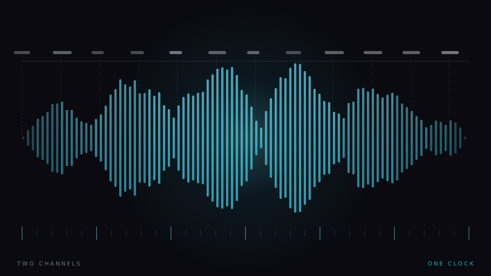
A watch is a listening device with a display attached. Speech as master clock, with the word and icon as the glanceable confirmation, is the version that survives a screen timeout — and it inherits the argument from reading versus listening rather than ignoring it.
Text arrives without typing
Nobody will load a document on a wrist. The article has to be pushed from a phone or desktop already parsed, or picked up from a queue built elsewhere. If getting text in takes more effort than reading it, the concept is dead on arrival.
Icons survive at glance size
A prototype that shows nothing but the curated set at watch scale, tested for whether the motion still reads. This is a two-week experiment and it gates everything else. It should be run before any app is written.
The privacy line holds exactly
On-device resolution, no account, no telemetry, zero bytes of your reading uploaded. A wearable is the most intimate device a person owns; a wearable reading app that phoned home would be worse than no wearable reading app at all.
The honest pitch is much smaller than the hardware invites. Not a library on your arm, and not a way to finish more books — just the four paragraphs you were going to read standing up, delivered one word at a time with a picture attached, in the gaps where you currently read nothing at all. If the icon test fails, we will say so on this page and the concept will stop here. In the meantime the format is available in full on a surface where you can still argue with it: open the app, set the pace to something uncomfortable, and see whether one word at a time is a thing you would want strapped to you.
A note on what this is. Signal is written in-house by the team that builds Reader Inc., so treat it as an argument rather than a review. Nothing here is medical, psychological or educational advice, and the app is not a treatment, therapy or diagnosis for any condition. Where we describe research we describe it in general terms; where we are reasoning past the evidence we say so. The app is free, runs entirely on your own device, and ships with a comprehension test switched on — which means you can check every claim we make against your own reading rather than taking our word for it.
Read next
The next decade of reading machines
Forecasts about reading technology usually describe the screen and forget the reader. Here is an attempt at the opposite — one constraint that will not move, five that will, and the only frontier we think is worth competing on.
The crowding problem
A letter you can read easily on its own becomes hard when other letters sit beside it. Crowding is normal, it is measurable, and it is the one thing single-word presentation does not merely reduce but abolishes.
Reading, listening, and the third thing
Text-to-speech is the fastest-growing branch of the speed-reading family, and the fair thing to say about it is that it wins some arguments outright and loses others badly. Here is which — and what happens when you lock the two together.