A map of assistive reading technology
A field guide to assistive reading technology — screen readers, text-to-speech, overlays, rulers, scanning pens, audiobooks and single-word streams. What each tool is for, what the evidence supports, and where the claims outrun it.

What this piece argues
- Assistive reading technology changes access to text; none of it teaches reading
- Speech tools have the strongest and least contested evidence on the map
- Overlays and special typefaces are popular; the controlled evidence is thin
- Single-word presentation has a clean mechanism and no trials where it matters most
The shelf of tools offered to people who find reading hard is long, and it tends to be arranged by marketing budget rather than by mechanism. That is a pity, because the tools genuinely differ — in what they change, in what the evidence supports, and in how far the claims made for them run past that evidence. What follows is a map of the territory, drawn to scale, our own corner included.
Assistive technology for reading covers anything that changes how text reaches a person: a two-pound plastic ruler, a fifty-thousand-line screen reader, a pen with a camera in its tip. Two questions sort the territory better than any brand name. First, what does the tool actually change — the look of the page, the channel the words arrive by, or the place the words appear? Second, what happens when somebody tests that change properly? The honest answer to the second question is usually “less than the box implies”, which does not make a tool worthless. It makes precise description more important.
The map has four regions. Tools that speak the text aloud. Tools that reshape the page while leaving it a page. Tools that capture print from the physical world. And tools that change the delivery itself, of which single-word presentation — the thing this magazine’s publisher makes — is the main example. Each region gets the same treatment here: what it is for, what holds up, and where the claims outgrow the ground under them.
Tools that speak
Screen readers — JAWS, NVDA, VoiceOver and their relatives — were built for blind and severely visually impaired users, and they remain the most consequential assistive technology ever attached to text. They do not assist reading so much as constitute it: for their core users there is no unassisted alternative to fall back on. They are keyboard-driven, deeply integrated with the operating system, and demanding to learn well. Their claims rarely outrun their evidence for a simple reason — the claim is access itself, and access either works or it does not.
Text-to-speech for sighted readers is a different tool wearing similar clothes. Here the synthetic voice runs alongside visible text, and the person using it could decode the words, slowly and at cost. For readers whose decoding is laborious, listening while looking moves effort away from word recognition and towards meaning, and the sensible claim — supported by classroom experience and a reasonable body of research — is better access to content that would otherwise be exhausting. The claim outruns the evidence the moment anyone suggests the listening itself improves unassisted reading. It is a route around the wall, not a course of masonry repair. We have set out that distinction at length in our piece on text-to-speech.
Audiobooks belong on the same peninsula. A skilled human narrator is still better than any synthetic voice, ours included, and for whole books the experience is hard to beat. For many purposes, comprehension of heard prose is broadly comparable to comprehension of read prose, and the persistent suspicion that audiobooks are cheating deserves retirement. What an audiobook cannot do is put the printed word in front of the listener at all — there is nothing to decode, so nothing about decoding is being practised.

Tools that reshape the page
The best-supported ordinary intervention on the whole map is also the cheapest: spacing. Pushing letters, words and lines further apart directly targets visual crowding — the interference of neighbouring letters with the one you are trying to recognise — and increased spacing has been found to improve reading speed and accuracy in dyslexic children with no training involved. Nearly every serious reading tool now ships a spacing control, and it is the first thing worth trying. Dyslexia-specific typefaces are a harder case: sincerely made and often preferred by the people who use them, but in controlled comparisons they have generally not beaten a well-spaced ordinary sans-serif. Much of what they deliver appears to be spacing and weight, which you can apply to a face you already like.
Coloured overlays and tinted lenses are the region’s most contested residents. They are widely used, often warmly described, and inexpensive. The controlled evidence is weak, and the better-designed studies have generally not supported the specific claims made for colour. That does not make anyone’s reported comfort false — comfort is worth something on its own terms, and a reader who gets through more pages under a blue sheet has lost nothing by using it. But comfort and mechanism are different claims, and only the second one has been tested. The full argument is in our article on crowding.
Reading rulers — a strip of card or plastic, sometimes tinted, sometimes with a cut-out window — are the humblest tool here and, in one sense, the most honest. They keep the eye on the line and mask the paragraphs above and below. There is little formal evidence for them, but there are also barely any claims for them to outrun: nobody promises a ruler will change your reading, only that it will stop you losing your place. A tool whose claims fit entirely inside its evidence is rarer on this map than it should be.
Tools that capture print
Scanning pens, phone OCR and document cameras solve a boundary problem: most assistive tools live in software, and most of the world’s text still lives on paper. A pen drawn along a printed line captures it, recognises the characters and reads them aloud; a phone camera does the same for a whole page. In examinations and workplaces this is genuinely liberating, and modern recognition is good on clean print. The limits are practical — unusual layouts, handwriting, tables and poor light all degrade it, and drawing a pen along every line of a novel is nobody’s idea of an evening. The claim outruns the evidence only when capture is sold as improving the reader rather than reaching the text. It reaches the text. That is plenty.
Tools that change the delivery
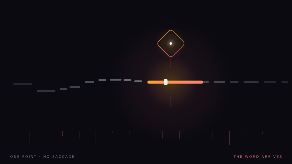
Finally, the corner we live in. Single-word presentation abandons the page entirely: one word at a time, at a fixed point, at a pace the reader controls. Two things are removed by construction rather than mitigated. Crowding is gone, because a word displayed alone has no flankers for crowding to operate on. And line navigation is gone — no line to track, no return sweep, no place to lose — which is the failure point that rulers and cut-out windows exist to patch. Our version pairs each word with an animated icon chosen by sense, on the bet that imagery supports memory through a second channel; dual coding and the picture superiority effect are real and well-replicated findings, and whether they transfer to this setting is our bet rather than an established result.
Now the concessions, because this category has earned scepticism the hard way. The removal of context cuts both ways: with no next word visible there is no preview, and with no previous word there is no re-reading, which for dense prose is a genuine cost. The wider RSVP industry spent a decade promising multiplied speeds at full comprehension, and the evidence went the other way — beyond roughly 400–500 words per minute on unfamiliar prose, comprehension falls. And the mechanistic case that matters most here — isolated presentation for readers who struggle — has not been trialled with those readers, by us or by anyone. A clean mechanism is a reason to run the study, not a substitute for it.
A tool that changes tonight’s chapter is not a tool that changes next year’s reading age.
The line every category must respect
The line the whole map respects
Every tool above, from the ruler to the screen reader to our own stream, changes access to text. None of them changes reading ability. The thing that changes reading ability in a struggling reader is structured literacy instruction — explicit, sequential teaching of the relationship between sounds and letters, delivered by people trained to deliver it. Software can make the evening’s reading survivable and the workplace navigable, and that is genuinely valuable. It is not the same claim, and a market that keeps blurring the two does its customers no favours. Our own list of refusals is published in what we will not claim.
How to choose, then. Start from the complaint, not the catalogue. Losing your place points at rulers, spacing, or a fixed point. Exhaustion after a page points at speech running alongside the text. Print you cannot reach points at capture. Words that swim points at spacing first, because it is free and the evidence is respectable. Try one change at a time, keep what demonstrably helps you, and be unsentimental about the rest. The map is crowded, but the terrain is walkable, and nobody has to buy the whole shelf to find the one tool doing real work.
A note on what this is. Signal is written in-house by the team that builds Reader Inc., so treat it as an argument rather than a review. Nothing here is medical, psychological or educational advice, and the app is not a treatment, therapy or diagnosis for any condition. Where we describe research we describe it in general terms; where we are reasoning past the evidence we say so. The app is free, runs entirely on your own device, and ships with a comprehension test switched on — which means you can check every claim we make against your own reading rather than taking our word for it.
Read next
Reading tools for dyslexic adults
Most dyslexia software is designed for children in classrooms. Adults with reports to finish and degrees to earn need something else. A survey of reading tools for dyslexic adults — what each one buys, and where the evidence stops.
Text to speech as a reading tool
Dyslexia is a difficulty with decoding, not with thinking — which is why a synthetic voice can hand a reader their own comprehension back. What text to speech reading does well, what it cannot practise, and why where the voice runs matters.

The crowding problem
A letter you can read easily on its own becomes hard when other letters sit beside it. Crowding is normal, it is measurable, and it is the one thing single-word presentation does not merely reduce but abolishes.