Low vision and the large-print problem
Bigger letters seem like the obvious answer, and sometimes they are. But magnification has a paradox at its centre, and the honest survey of low vision reading tools has to start there — with what enlargement quietly takes away.
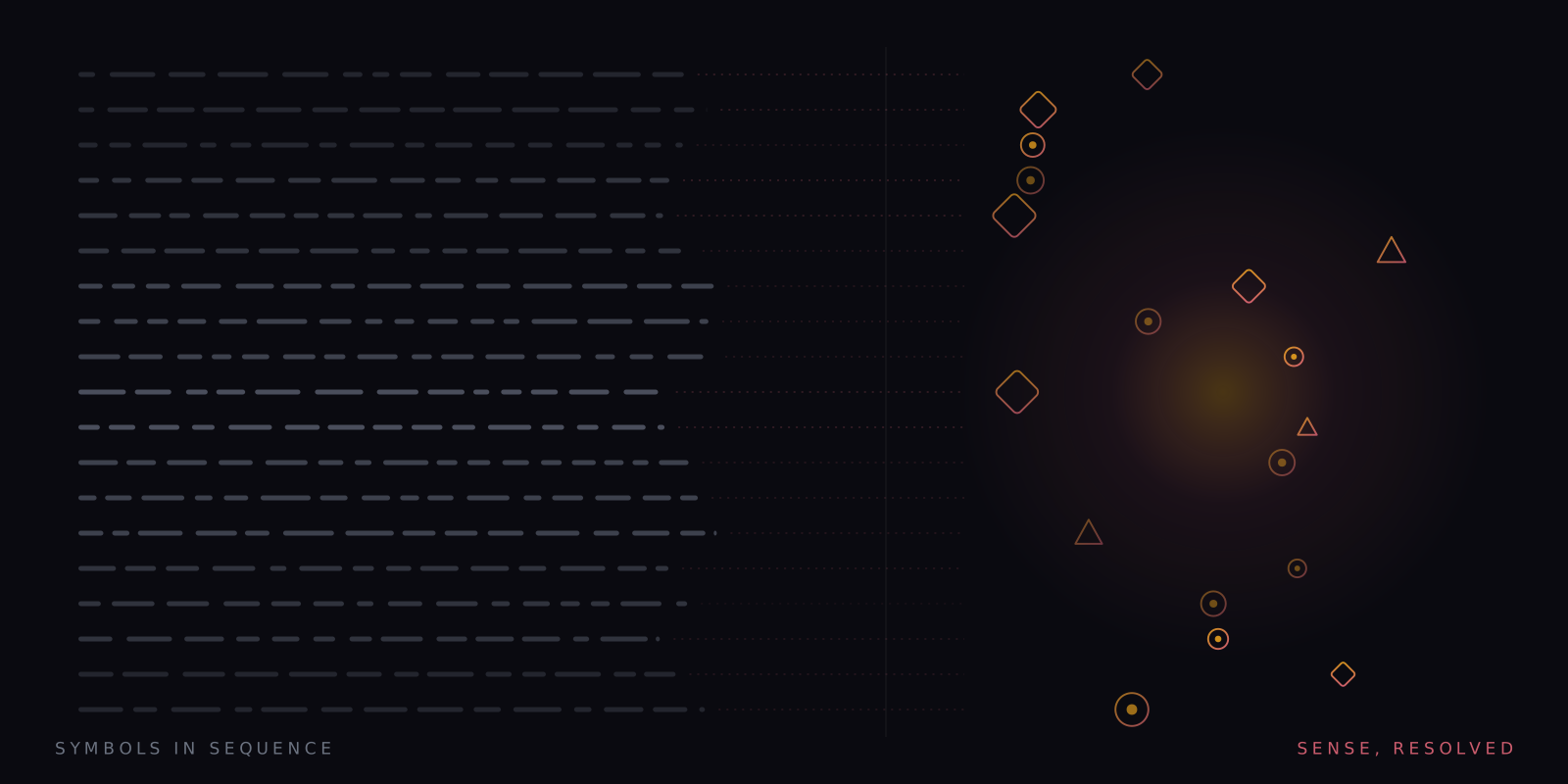
What this piece argues
- Magnification helps, but it pushes more of each word into crowded peripheral vision
- Fewer words per line means more line-finding, which is where reading often breaks
- Large print, magnifiers, e-readers and speech each solve a different part of the problem
- A single large word at a fixed point sidesteps the paradox — and is untested by us with low-vision readers
The intuition behind large print is so natural it barely feels like a claim: if the letters are hard to see, make the letters bigger. Sometimes that is exactly right, and a well-set large-print edition rescues reading for another decade. But magnification carries a cost that almost nobody selling it mentions, and the cost grows with the very enlargement that delivers the benefit. Understanding that trade is the difference between choosing a tool and buying one.
Low vision — sight that ordinary spectacles cannot fully correct, from macular degeneration, glaucoma, diabetic retinopathy, cataract and a long list of rarer causes — is mostly a condition of later life, and reading is consistently among the first activities it threatens and the one people most want back. The standard prescription is size: large print reading editions, big-type settings, handheld and video magnifiers. Size genuinely helps, especially when the problem is acuity — letters too small to resolve. If the story ended there, this would be a short article.
It does not end there, because print size is not the only constraint on reading, and past a certain point it stops being the main one. The other constraints are about where the letters fall on the retina, how many of them are usable at once, and how the eye finds its way around a page. Each of those gets harder, not easier, as the type gets bigger.
The paradox of bigger letters
Sharp vision is a small privilege. Only the central couple of degrees of the visual field — the fovea — resolves fine detail; everything outside it is coarser, and, crucially, more crowded. Visual crowding is the interference of neighbouring letters with the recognition of a target letter, and it scales with eccentricity: the further from the centre of gaze a letter sits, the more its neighbours smear into it. Bouma’s law is the shorthand — the interference zone grows roughly in proportion to the distance from fixation. This is ordinary vision, true of every sighted reader, and it is why the useful window around each fixation is only a handful of characters wide.
Now enlarge the text. Each word gets wider on the retina, so more of every word falls outside the small central region and into the periphery — where crowding is stronger and detail is coarser. The visual span, the number of letters usable in one fixation, shrinks. The eye that once took in a word or two per fixation now takes in part of a word, which means more fixations per line, more work per sentence, slower progress overall. Magnification buys resolvable letters and pays for them in usable letters. For many central-vision conditions the purchase is still worth making — an eccentric viewing spot needs letters large enough to survive the periphery at all — but the bill is real, and it explains the common complaint that hugely enlarged text is legible yet exhausting.
The second cost is navigational. Enlarge the type and fewer words fit on each line; the paragraph that once occupied four lines now occupies a dozen. Every line ends in a return sweep — the long leftward jump to the start of the next line — and the return sweep is where readers lose their place. More lines mean more sweeps; large type plus a magnifier’s narrow window mean sweeps executed partly from memory, hunting for a line-start that is off-screen. Ask people with low vision what defeats them and line-finding features at least as often as letter-seeing. The two problems are different, and size only addresses one of them. The general problem has its own article — keeping your place on the line.
The toolkit, honestly described
Large print reading editions remain a good first move: professionally set, generously spaced, and demanding no apparatus — though publishers decide what exists in large print, and the catalogue thins quickly outside bestsellers. E-readers quietly improved on them, and are probably the most under-recommended low-vision tool of all: any book, any size, adjustable contrast and spacing, and reflowing text, which matters enormously — when enlargement reflows into short honest lines rather than spilling off the page edge, the navigation problem shrinks instead of growing. Optical and video magnifiers extend the same logic to post and pill bottles and print that will never be digital, at the price of a narrow moving window over the page. And screen readers with synthetic speech remove the visual channel altogether — the endpoint of the continuum, and for some readers, on some days, the only setting that stops the arms race between size and span.
Note what the list is doing: each tool trades along the same two axes, letter size against window size, vision against speech. None escapes the geometry. The choice is about which costs a particular pair of eyes, with a particular condition, on a particular day, can best afford — which is why the right sequence usually starts in a low-vision clinic rather than a shop.
Magnification buys resolvable letters and pays for them in usable ones.
The trade, stated plainly
Where a single large word genuinely helps
There is one configuration that steps partly outside the trade, and honesty obliges us to point out that we make it. Present one word at a time, at a fixed point, and three things follow by construction. The word can be enormous without pushing neighbours into the periphery, because there are no neighbours — flanking words are absent, so word-on-word crowding has nothing to operate on. The visual span stops mattering in the usual way, because no fixation ever needs to cover more than the word in front of it. And line navigation disappears entirely: no lines, no return sweeps, no place to lose, no window to steer. The reader holds one spot; the text does the travelling.
Within the word, its own letters still crowd one another, and a long word rendered huge still extends into the periphery — the geometry is bent here, not repealed. The pacing is a genuine cost in this setting too: words that vanish on schedule cannot be lingered over, and re-reading — which low-vision readers do a great deal, for good reason — is gone unless you stop and step back. In the app the pace is the reader’s, down to very slow, with dwell stretching on long words and sentence ends; whether that is enough is exactly the kind of question that needs real users to answer, not a paragraph.
What to do with all this
A practical sequence, for a reader or the family of one. Start with a proper low-vision assessment, because the right tool depends on which part of the visual field is damaged, and that is measurable. Then prefer reflowing digital text over frozen print wherever the choice exists — it is the single decision that makes every later adjustment cheaper. Then experiment honestly along both axes: size and spacing on one, speech on the other, in whatever blend gets you through a chapter with the least fatigue. Blends are underrated; listening while following enlarged text is a perfectly respectable way to read.
And if you try the single-word configuration, treat it the way this magazine treats everything: as an experiment with a result you own. Set the word size generously, the pace conservatively, run a passage, and take the recall check. If it holds your comprehension while sparing the line-hunting, you have found something useful and you should not much care that the trial had one participant. If it does not, the ordinary toolkit is well mapped, and the geometry — for once fully on the table — will tell you which corner of it to try next.
A note on what this is. Signal is written in-house by the team that builds Reader Inc., so treat it as an argument rather than a review. Nothing here is medical, psychological or educational advice, and the app is not a treatment, therapy or diagnosis for any condition. Where we describe research we describe it in general terms; where we are reasoning past the evidence we say so. The app is free, runs entirely on your own device, and ships with a comprehension test switched on — which means you can check every claim we make against your own reading rather than taking our word for it.
Read next
The crowding problem
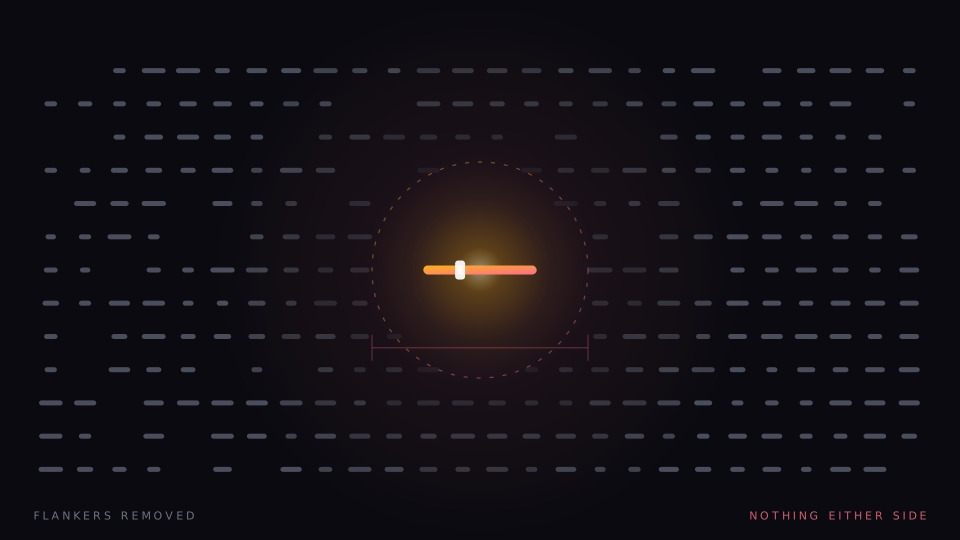
A letter you can read easily on its own becomes hard when other letters sit beside it. Crowding is normal, it is measurable, and it is the one thing single-word presentation does not merely reduce but abolishes.
Reading into older age
Eyes change, pace changes, and the stack of unread books does not shrink to match. An honest survey of reading tools for older adults — what actually helps, what merely sells, and the one cost of our own approach that bites hardest here.
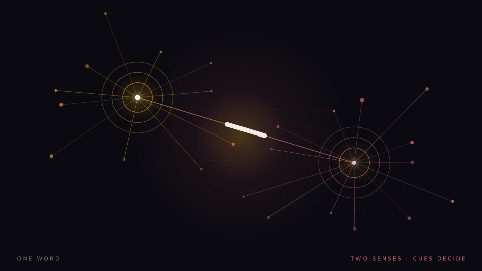
A map of assistive reading technology
A field guide to assistive reading technology — screen readers, text-to-speech, overlays, rulers, scanning pens, audiobooks and single-word streams. What each tool is for, what the evidence supports, and where the claims outrun it.